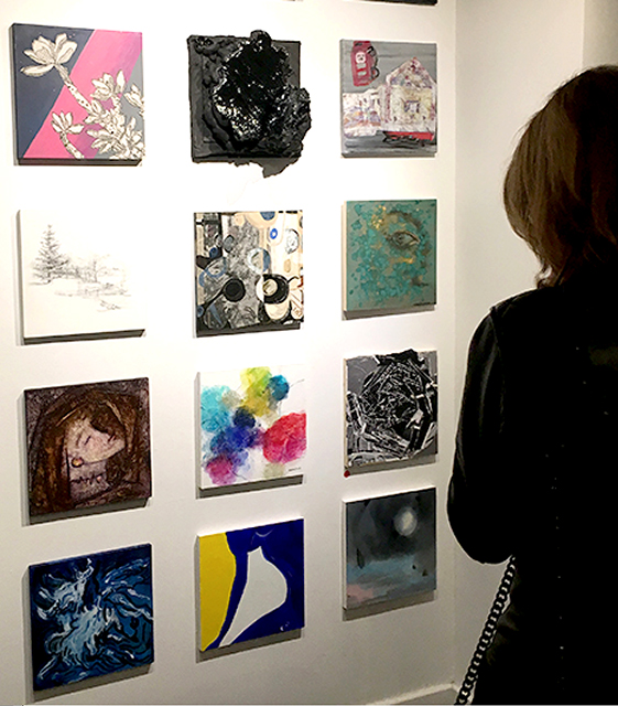
The image here shows my collage – a work with paper and paint on a 12 x 12 inch panel in tones of black, grey and white. It’s installed with other 12 x 12 inch works at the Pelham Art Center – all created by artist teachers and donated for the Center’s Studio Café benefit event. My work is in the middle vertical row and one row down from the top. This image shows 12 works. There were actually 25 works installed in a 5×5 grid.
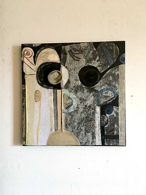
This is the first image. I think it looks like a face. I painted black acrylic on the wood panel and cut curvy shapes from two pieces paper – one a light-toned Washi paper, and one a white and tan mono print paper. I glued the papers down on the black painted panel. It’s magical and unpredictable the way the black paint shows through the thin paper and glue. The tan and white paper on the left doesn’t allow the black paint to show through.The thin white Washi paper on the right lets you see splotches of tonal black through. The solid black areas are paint alone.
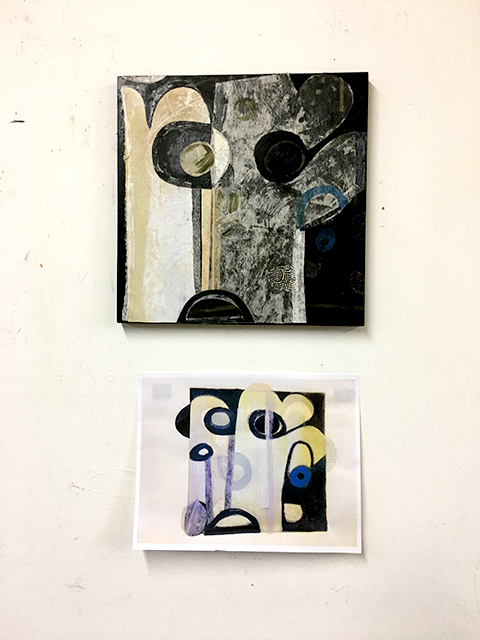
The image above shows the 1st version of the collage in my studio on the wall above an 11×8.5 inch image of a print collage. I decided to create a variation of the work seen on the bottom, because I wanted to explore the curvy design. It’s also fun for me to see something in front of me as I work.
I wanted to change the design and decided to add papers to the right side of the collage. Some papers are small half-circle shapes; some papers include drawing that echo the curvy design..
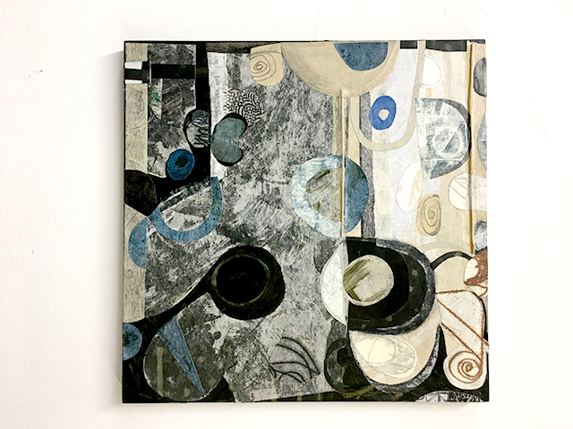
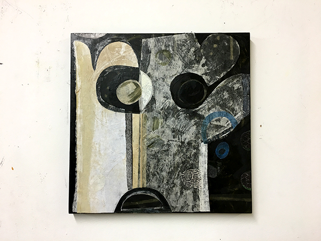
This image shows the collage upside down. I often rotate the panel as I work to see if I like it better. I added white papers within light areas and dark papers within dark areas to carry the design to the right edge and beyond the edge. In another session, I rotated the panel again and added new papers, pencil and paint. I cut and glued light and dark papers to create more of a sense of horizontal against the vertical in the design.
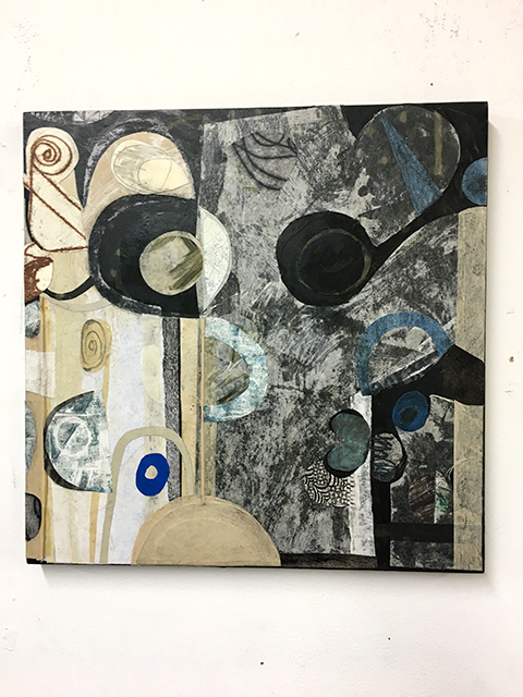
It’s hard to tell, but I added more tiny papers, both light and dark, to change the design. Some papers extend around the edges of the wood panel on the left and right sides.
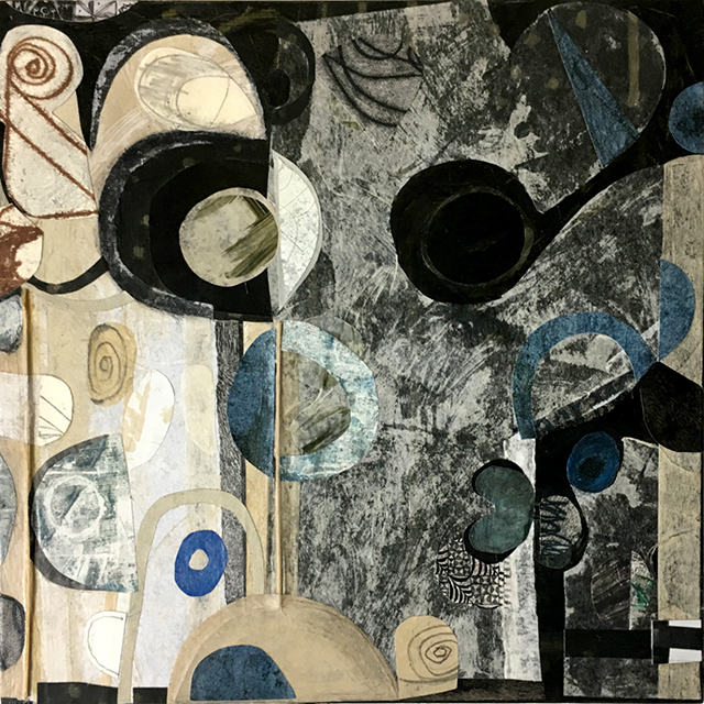
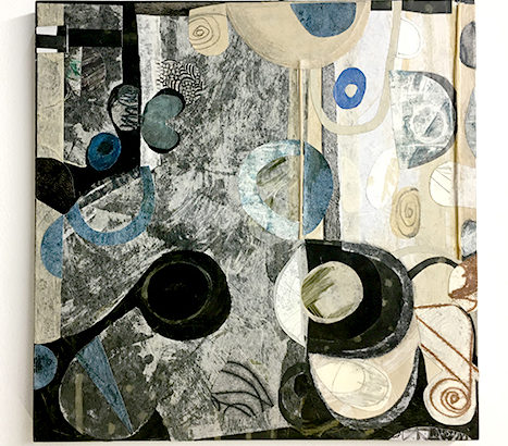
This is the 5th version of my collage. I added more small collage papers on the top and sides of the panel to make the panel seem more dimensional. I added subtle tonal drawing with blue Prismacolor pencil.
I took photos at the end of each studio session to document how the work changed – remembering a monograph about Henri Matisse that showed 15-20 revisions to his oil painting titled Pink Nude. Taking pictures of my own work in progress and writing about how the image changed was a good thing to do. See Matisse’s Pink Nude (in the permanent collection of the Baltimore Museum of Art, Baltimore, MD) here.